Logo for Moka Studio
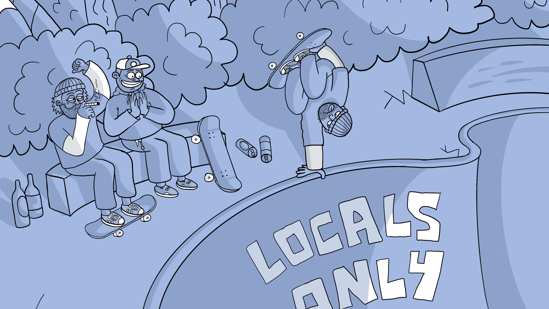
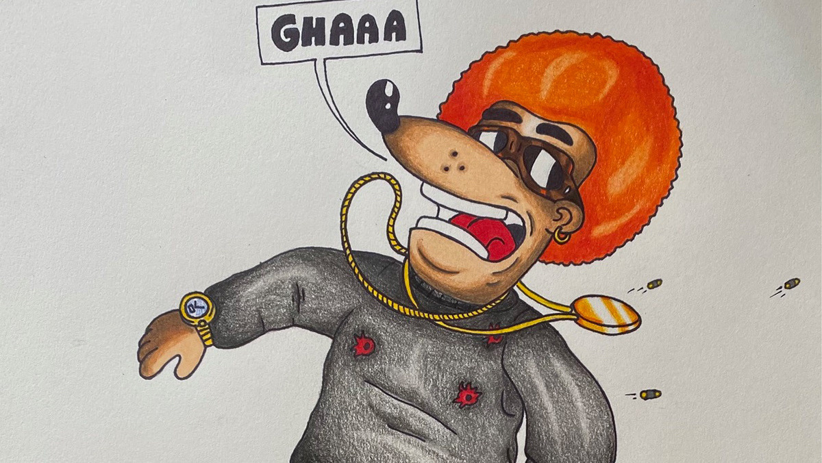
Moka studio is an eco-friendly, hand-embroidered brand that belongs to the urban/skate world. Taking inspiration from Moka's principles, I created a mind map (on the top right) and a mood board (bottom left) that helped to recreate the brand's essence through images and colours. Moka Studio has a funny, cartoonish stamp, rich in colours, natural characters and social messages; the logo must reflect its unique substance. To do that, I started by collecting brands, objects, images and artists that the brand feels belongs to it, creating a mood board on Photoshop. After combining the concepts, I made a mindmap with all the information needed to keep track of the project's aim. Urban artists like "Lugosis" (Italian graffiti/tattoo artist) or "Lofi" (skate brand from Perth) inspired me for the main subject and the font. At the same time, for the colour palette, I wanted to keep the ones currently in use by the brand to maintain its distinct mood on social media and the website. Brining ideas together While working on the logo, I had to fix a few details that made the design look asymmetrical and not entirely proportionate; for example, the funnel where the coffee spills out was too close to the Moka's hairbows, and the whole body of the Moka pot wasn't entirely centred on the fire stove. During the creation process, the client also noticed she didn't like the initial grey colour used for the Moka pot, so we brainstormed to find the proper one that would satisfy the client's domain. Once everything has been fixed and put in the right place, the design is ready to be printed or used on the web.
