Slaughter at the Opera House
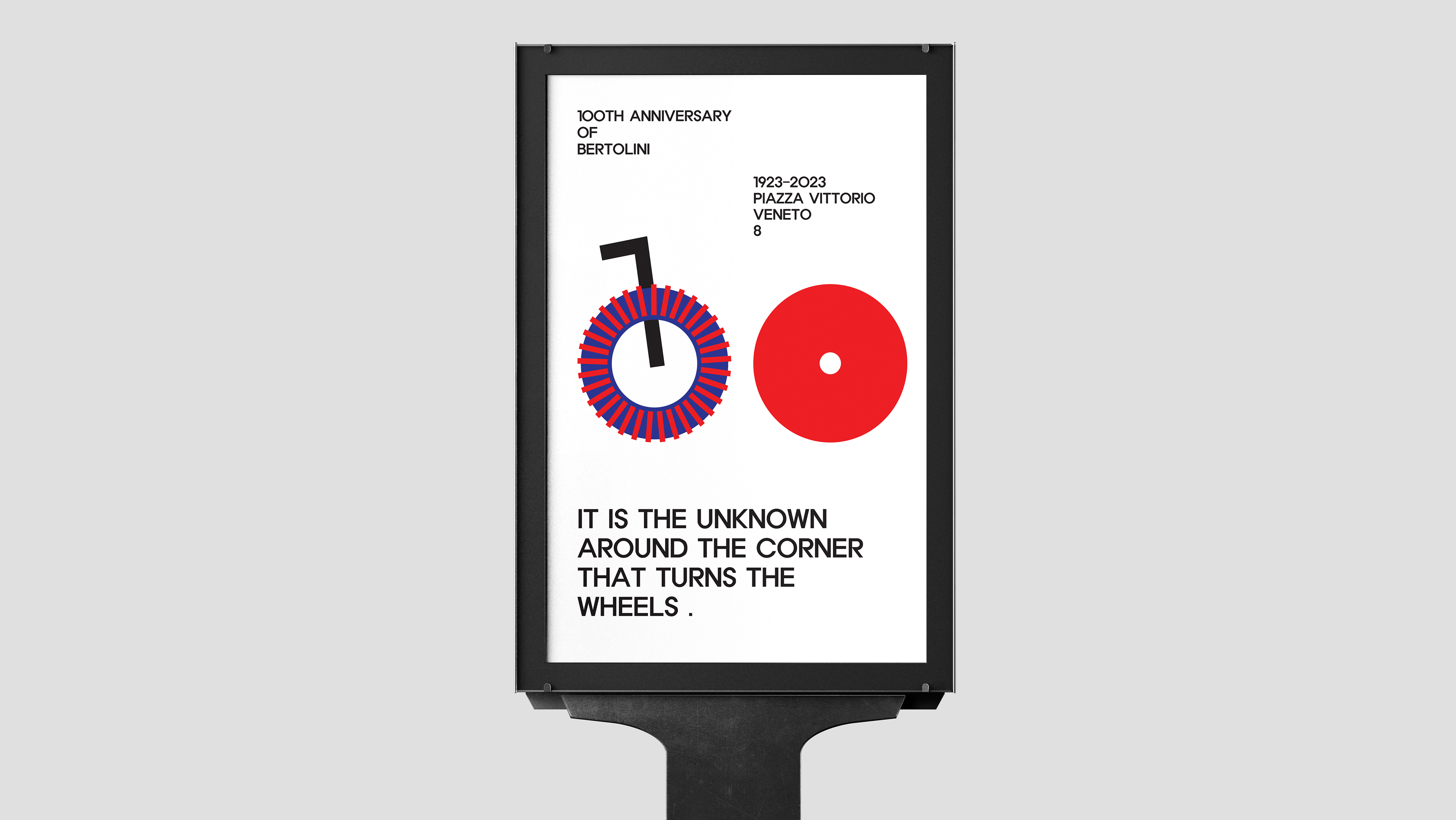
For this project, I took inspiration from the European Swiss Design movement, which I had previously examined and investigated for project 1. Slaughter at the Opera House, a skateboarding event that took place in 2008 at the magnificent Sydney Opera House, motivated me to experiment with Adobe Indesign by adopting the Swiss graphic design principles for the poster and brochure. I began this work by using Procreate on the iPad to create a mindmap about the content and sketch out the layout of my brochure. Then, using a grid with 10 mm margins, 12 columns, and 3 mm bleeds as specified by the brief, I began working in Indesign to create my brochure, which has four pages (a front, a back, and two spread pages on the inside). This gave me the opportunity to work with a structure very similar to the Swiss graphic style. Their posters are distinguished by their widespread use of grids to give hierarchy to the visual elements with asymmetric layouts. And that's exactly what I tried to do as well. I used two Sans-Serif fonts, "Roboto" and "Roc Grotesk", two of the many typefaces inspired by the Europen movement, with their tight spacing between letters, which gives a solid appearance to the title and the content. To enhance Swiss style even further, inspired by Mike Joyce with his beautiful geometric abstraction, I added some arched elements that repeat over and over until, once all together, they take the shape of a skateboard ramp. This was the graphic element I created for this project that most united the two worlds so far apart. Once you open the brochure and explore the inside, the opera house is mirrored on both pages, but on the left side, a skater is flying over the theatre. In contrast, on the right side, it is possible to find more information regarding the event. In this work, I attempted to emulate as closely as I could the ideas that have defined Swiss design up to the present day by emphasising negative space and the simplicity of shapes and colours.
